There are several elements that make contact pages work. Of course you’d rarely have all them combined into your contact page. Some contact pages contain only one of these elements while other implement more. See them and figure out which will work best for you.
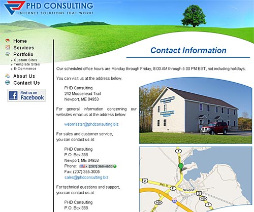
Contact Info + Address And Map

These contact pages usually contain your picture, a link to social profiles, street address and a map. It’s a good way to build a contact us page if you are willing to share your location. It shows you are a real person or company, and builds trust.
Here is this example with only the person’s picture missing.
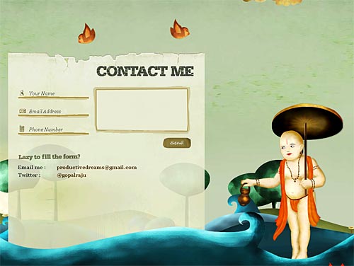
Impressive Design
Design might not be the first you think about when building your contact form. Too bad! It’s one of the most important pages on your site. A “contact us” page that looks amazing does few amazing things:
- Keeps the visitor on the page. So they hopefully will really fill that great looking form rather than closing it!
- Builds trust (again). If your contact form looks great perhaps you are offering great services or products too
- Goes viral. There’s no need to give you links to posts that link to amazing contact forms. In fact, this is a such post too. Here is one amazing contact form. And below is another:
Headset Hottie
There is no joke. A “headset hottie” can draw some attention and give the feeling there will be someone to answer. People know they are fake but they still like them. There is even a whole site dedicated to headset hotties.
It’s better however if you put your own picture or a picture of your real staff (if you have any).
More Than One Contact Method
Please don’t leave us hanging on a contact form or email only. You must have at least one social network profile where I can reach you. Twitter, Skype, and/or phone number are also highly positive. The more options you give to connect, the more likely your visitors are to do it.
Call To Action
The reason you build a contact page is that you want people to contact you. You know how bigger are your chances to make business with someone who already contacted you than with a stranger.
So, make it clear where the contact form is (you do have a contact form, right?) and make that button big and appealing. Make people crave to click it so badly that they won’t get bored by the rest of the fields they have to fill.
Contact Form Autoresponder
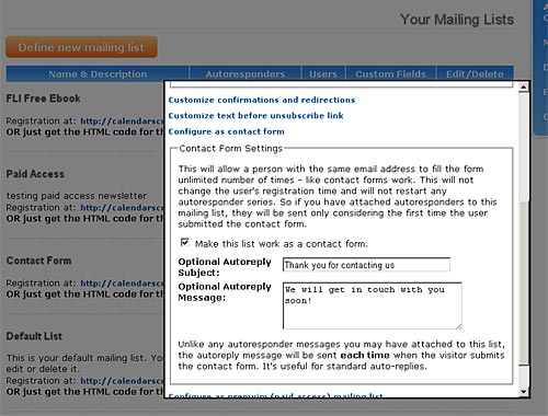
I’m not talking about the “thanks for contacting us” auto-reply. Sometimes it’s useful to confirm that the message has been delivered and to keep your address in the prospect’s mailbox. Don’t rely too much on this however as people barely check their read mail again. It’s a lot more important to reply to their inquiry.
But why not go further than this? You could also subscribe everyone who contacts you to a mailing list or autoresponder. Of course you’d better let them know in advance and request email confirmation before doing this. This can be implemented with the PRO version of BroadFast Autoresponder for example.
Because these people already made the effort to contact you they are likely to be interested in what you offer. So your autoresponder may work well on them. Just don’t look at hard selling – better include them in informative newsletters or autoresponders and build trust over time.
List Your Other Websites
If you have more than one site (and they are related to each other), your “contact us” page is a great place to share them. Here is why:
- Lets people check what else you do. Again this builds trust.
- Helps you get some traffic on the other sites. And maybe a customer too?
- If they didn’t find exactly what they were searching for maybe they’d find it on the other sites?
List the other sites gently under the main contact info and make sure they open in new tab.
Give Your Other Channels
Having Flickr account, Youtube or Vmeo channel, shared Delicious list, or Behance profile? Your contact page is a good place to share them too.
Keep The Contact Form Easy And Simple
Don’t forget that people have to actually fill that form to get in touch with you. Although some will use the other contact options most will fill the form. So make it easy and simple:
- Keep fields to the minimum. Name, Email, Message and (maybe) subject/reason. (Don’t call it “department” please, I don’t give a dime about how you structure your company internally)
- Make gentle validation. Something like jQuery validator will do the work. Or see a bunch of other validation plugins.
- Avoid captchas if possible and use other ways to stop spam.
- Make tab order work correctly. Don’t make us click every field with the mouse.
Follow these practices and let me know the outcome. If we can help you with autoresponder software or designing your contact page, contact me via my contact page. I know it badly needs rework! (Goes in my to-do list)


